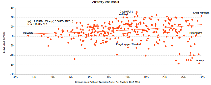
Ever wondered how austerity affected Brexit? Sure you did, but there’s a reason nobody made a nice chart yet. To answer the question, you’d need a breakdown of consolidated central, regional/national, and local government spending by some geography or other (parliamentary constituency, local authority, super-output area, whatever). That in turn means you’ve just constructed your own exquisite hell of cost-allocation accounting to deal with the UK’s numerous overlapping jurisdictions.
Something like this data set does exist – here – thanks to the Centre for Cities, who wanted it for this report – but sadly it was so much work that they haven’t either taken it backwards to create a time series or updated it. If you want to know the effects of austerity, your question compiles down to something like “what is the correlation between the vote for Brexit and the percentage change in the sum of real-terms Departmental Expenditure Limit and Annually Managed Expenditure between 2010 and 2016, for each specified geographical area?”, so this can’t help us.
But there is some data available. Since 2012 the Government has published an annual analysis of how much cash money local authorities have to spend, both in absolute terms and on a “per-dwelling” basis as a crude population weighting.
The current report, for 2016-2017 onwards, is here. This doesn’t cover the NHS, most social benefits, big infrastructure, or central government salaries, but it strikes me as a defensible hypothesis that the same councils who get clobbered by DCLG-managed austerity will also get it from the Treasury. Also, it only covers England. But it’s as close as we get to publishing an acknowledged financial settlement between bits of the country.
Here we go, then.
Greater austerity – i.e. a bigger cut in spending on a per-dwelling basis – is to the right. The Leave lead is just the percentage Leave vote minus the percentage Remain vote. The answer seems to be “Nobbut bugger all” – there is a correlation but it’s very, very weak and the R^2 is 0.12.
We can think about this by pulling out some data points with similar values. Uttlesford, which somehow managed to get a 17% uplift in its funding, was a tie; so was Birmingham, despite a -28% spanking. Great Yarmouth did even worse financially, -29%, and voted to Leave by 43 percentage points. Castle Point was even more Brexity than Great Yarmouth although it lost “only” 9.72% of its money – a little less than Kingston upon Thames, which went or rather stayed Remain by 20 points. Great Yarmouth’s financial suffering was rivalled only by Hackney’s, which set the record for voting Remain.
It’s almost typical of Brexit-related charts, really – R^2 values are terrible, outliers abound, and correlations, such as they are, are powered by weird special cases. Ashfield, Nottinghamshire got away with an -8.9% cut, but racked up the sort of Leave vote – 40+ points – you might expect in South Holland and The Deepings. Can it be…the influence of the great statesman who was its MP for 18 years?
Snark aside, I do think there is a serious point here. This was a remorselessly personal, emotional event rooted in life courses and irreducible choice. That’s why statistical aggregates and polling were poor predictors and why impressionistic journalism seemed to work so much better.

Cannot disagree. Trying to reduce complex structures and processes down to one or two simple variables is a mugs game. You end up knowing more and more about less and less until you end up knowing everything about nowt.
Trying to focus on recent media memes such as austerity ( post 2009) ignores the austerity which has existed in many communities since the 1980’s (before the media fell in love with the term) as well as local and regional cultural factors. The loss of staple industries like mining, steel manufacture, engineering and their support industries, which de-skilled employment and wrecked communities, for example, meant that even after an area such as South Yorkshire had some £1 billion of EU Objective One funding ploughed into it at the turn of the century it’s GDP per head remained below that of Greece only until the onset of the Greek crisis of 2011.
Little wonder you have traditional Labour heartlands like Barnsley, Rotherham, Doncaster and the Dearne Valley sticking two fingers up to the ‘you’ve nowhere else to go’ crowd. Even Sheffield voted narrowly to leave. It would perhaps be more worthwhile looking at comparisons between regions/sub regions such as SY, Greater Manchester, Merseyside, the NE and Scotland to assess what range of factors have been at work over a longer period. Certainly, austerity alone in its more recent manifestation tells us nothing.
Permalink