Here’s a really excellent post from Lord Ashcroft of all people.
Something I occasionally bang on about is that public opinion has more dimensions than just agree/disagree. Pollsters very often ask about how important issues are, as well as which party you agree with on them. The difference between which issues respondents rate as important for themselves, personally, and for the nation as an abstract idea, is often very big.
Consumers of polling, like politicians and journalists, rarely put the two measures together. Obviously, it’s better to have a lead on something that is more important to the public than something that is less important. If Issue X is 10 times more important, subjectively, than Issue Y, a 1 percentage point lead on X might be worth as much as a 10 point lead on Y.
Some politicians get this wrong. Eurosceptics, for example, look at the number that says the public seems to agree with them, and miss the one that says that the public doesn’t care very much. It’s natural to overestimate how important the issues you think are important are to others. It’s also natural to overestimate how important issues you think you can win are to others. It becomes a problem if you do it with everything. Everybody’s met Uncle UKIP and Auntie Palestine, who collect political obsessions to go with the ones they already had, like crockery.
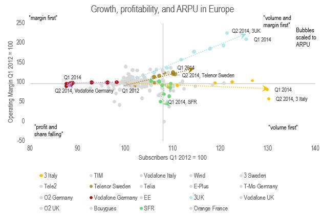
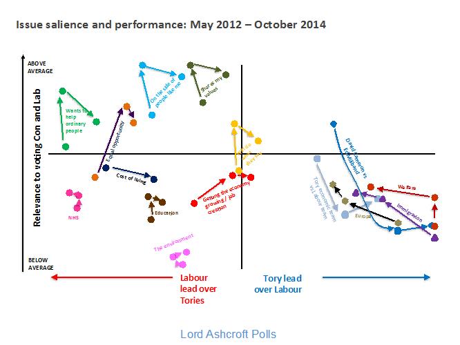
Ashcroft has a really nice chart based on his polls, which always ask about this. Although it’s not that pretty, it’s a great example of data visualisation – it shows both the relationship between two lots of data and also the change over time, and it uses a classic consultant’s trick to tell a story, cutting it into quadrants by setting the axes at the average values. Here’s one I made earlier with some mobile phone companies.
You can see that a lot are average, some are worse and getting worse, and there’s a group who are doing really well. There’s a key factor that links them, but if you want to know that you can buy the report. So it is with Ashcroft, although I took more time over the graphics.
So, the left half of the chart shows issues that Labour has a lead on, the right, the Tories. Higher on the chart is more important, so you can think of the two upper quadrants as being the two big parties’ target areas. Because the data points are plotted one after the other, you can also see change over time.
First point: Labour has a lot of issues in its half of the chart. Second point: some of them are important. Third point: the Tories have only a small group of issues on their side, and they are relatively unimportant.
Fourth, and really importantly, Tory issues move together.
As a first guess, I would discount a lot of the movement on this chart as noise. A lot of the issues dance to the music of sampling error, or just follow the national voting intention poll. But look at the curves for “Cameron vs Miliband” and “Tory economic team vs Labour”. They have changed a lot and they have done it in the same way.
While all the Milibashing has convinced some people – it’s moved right – it’s also sickened a lot of people, because it’s moved down, a lot. When you campaign, you’re trying to do two things: convince, and mobilise. You need to win the argument, but you also need to make people think it was worth having the argument. The Tories are paying for the success of pouring abuse on Miliband with the people turned away by the undignified bully yelling. This goes, quite clearly, for the personalisation strategy in general.
Then, look at the other Tory issues, like “Welfare”, “Immigration”, and “Europe”. They are also moving, and moving together, but they are moving in the opposite direction. They are being driven up the agenda, gaining importance, but at the same time, they are moving left. Milibashing convinces but demobilises; playing ‘kipper mobilises but does not convince. It’s been pointed out before that since the prime minister took up Euroscepticism as a theme, the European Union has become more popular.
There’s a good reason for this, which serves as an example. There are about 2.5 million other Europeans in the UK and as many Britons in the rest of the EU, for a total of 5 million people who use the open border as directly as possible. There are about 60 million people here. If you reckon about 10 close family and friends each (the median number of names in a mobile phone calls list is between 7 and 10), very roughly, there are four chances in five that you love someone who would be affected by exit. It shouldn’t be surprising that if leaving the EU is put on the agenda, as a real thing rather than an abstract idea, a lot of people would think again.
Of course, the distribution won’t be that even, but then, this doesn’t count anyone who needs to trade with Europe, who owns property there, who wants to take on public sector contracts there, who draws farm subsidy, etc. Either way, that’s a hell of a lot of people. Pleasing the smallish group of people who care intensely about hating the EU comes at the cost of alienating them.
The Crosby strategy is very obvious from the chart – look how tightly the Tory issues are grouped together. But it’s like a marksman boasting of the tight grouping he got on the wrong target. They’re doing it with everything. Perfection would be getting your issues towards the top corners of the chart, both convincing and mobilising.
Now, what about Labour? The big changes on our side are the economy, which has moved Torywards and gained a bit of salience. £55bn in cuts ought to do something there. “Cost of living” is really salient, and has come in a bit. More action against the privatised utilities and landlords is the obvious recommendation. But the really interesting one is “Equal opportunity”, which has gone way up in importance. Both are even higher than the NHS or education.


Permalink
Great spot of Ashcroft’s post. It’s a little depressing how many things are shifting the Tories way, even if not decisively. One can imagine that if Osborne had been smarter and soft-pedalled austerity policies better (while keeping up the rhetoric) the Tories would be in an even stronger position. And one can imagine that a bit more drift on “shares my values” could tip the balance still.
I think “Equal Opportunity” is a really interesting issue, because it steps around some of the cynicism. The electorate can’t help but be a bit cynical about the NHS and Education because the Blair years contained so much Tory speak that it’s easy to say “those politicians, all the same, can’t trust ’em.” But equal opportunity just isn’t baked into the Tory party – they don’t really believe in it. And, despite the efforts of the right-wing press to make statements about “Tory toffs” toxic, there’s a reality about the braying Eton accents and attitudes (Cameron, Osborne and crucially BoJo) that I think penetrates to the politically indifferent. Oddly enough, Farage’s reality distortion field (wherein he managed to pretend to be an everyman) also damages the Tories on this issue, because it highlights how patrician they look.
The Labour values are largely moving in lockstep as well: assuming the plotting is all relating to the same polling points, then it’s going up (as in, more likely to vote) and then right (less likely to vote Labour) (with the exception of the NHS, but then that’s why the Tories hate the NHS anyway). So the outcome of this data, for Tories, could well be ‘if they keep going the way they’ve been going of late, they can flip some assumed ‘Labour’ to Tory motivating values, a la the economy and whatever that value in yellow is that I can’t read.
“Party will do what it says”. Of course a lot of people might take that as a threat:-)
Permalink