A lot of economists were arguing after Thatcher’s death something like this – the recessions caused terrible and lasting social misery, most of the North Sea oil money went up in smoke, the Lawson property boom didn’t do anyone any good, but you know, GDP per capita caught up with the Germans. Here’s Jonathan Portes of NIESR:
Thatcher’s economic legacy in 2 charts: supply side growth improvements, at huge & unnecessary social/economic cost: twitter.com/jdportes/statu…
— Jonathan Portes (@jdportes) April 8, 2013
Jonathan Hopkin points out that this gets much oversold, just because the people who argue this tend to use cash exchange rates, and the Thatcher government spent a lot of time targeting a high exchange rate with the D-Mark. If you plot the purchasing-power parity rate it’s less impressive.
Yet more evidence of Thatcher’s economic miracle. If you squint hard enough, through those blue-tinted spectacles twitter.com/jrhopkin/statu…
— jonathan hopkin (@jrhopkin) April 12, 2013
Then, I saw this quote from Tony Benn:
The second thing is, despite the fact we have been told we are an entrepreneurial society, this is a country today that has an utter contempt for skill. You talk to people who dig coal, run trains, doctors, nurses, dentists, tool-makers – nobody in Britain is interested in them! The whole of the so-called entrepreneurial society has focused on the City news we get in every bulletin, telling us what has happened to the Pound Sterling, to three points of decimals, against a basket of European currencies. Skill is what built this country’s strength, and it is treated with contempt!
(From here.)
This is, as often with Benn, a bit hard to take at face value. Having been a government minister in the 60s and again in the late 70s, he knew from watching the sterling exchange rate. British governments in the postwar era were obsessed by sterling exchange rates. The Tories pulled out of Suez in the name of the sterling parity; Wilson gave up economic planning in its name. Callaghan sent Healey to the IMF in its name. There was probably no issue that drew quite so much water.
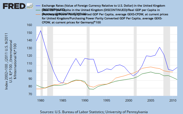
And with good reason. Here’s a chart I made earlier.

The blue line is an index of the sterling exchange rate; I wanted either sterling/mark or the trade-weighted index, but they’re not in FRED yet. The green line is the ratio of real, per-capita GDP in the UK and Germany, multiplied by 100 to fit the chart. The orange line is the same, but using PPP GDP.
The point that comes to mind is that if this ratio means anything, it improved a bit in the Lawson boom because there was a housing bubble, duh, and then lost it all and more in the second Thatcher recession. Also, the PPP/cash distinction matters much less than I thought.
Another point is that things were so much better without Thatcher. So much more catching-up happened later, and of course reunification and the pre-Euro sparpakets helped this metric from the other side. Nobody talks about a Major miracle, and the Brown boom is hugely unfashionable, but perhaps they should. One of the reasons why is that they didn’t have as many disasters.
And yet a third is that the pound sterling mattered, a hell of a lot. Things got better, a lot, after the 1992 devaluation, the abandonment of Thatcherite hard-money thinking, and they kept going until…just after a big run-up in the pound. This should be a simple point, as there were basically two policy regimes under Thatcher – monetarism, until they gave up on it, and then a strong-pound policy which was formalised by ERM entry. 1992 was a structural break with both.
If you care about skill, certainly, watch the sterling exchange rate!
Another point, not much discussed, is that the mid-2000s were better than the late 2000s but they weren’t that fantastic. The orange line shows this clearly.