OK, so as well as the big demo, currently standing at 578 coaches and counting, there’s going to be a day of action on the NHS on the 1st of April – April Fool’s day, surely someone can make something creative out of that. So I thought I’d open another flank. Flipchart Fairy Tales has already covered the issue as well as anyone will, but the point is quite simply that they’re all lying to you about public pensions.

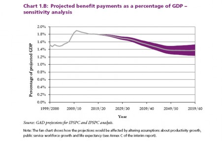
That’s a chart of the forecast cost of the entire public sector pensions system as a percentage of GDP, with a sensitivity analysis showing what happens to it if you change various parameters like life expectancy, productivity growth, and such. The coloured area each side of the line on the chart (the central projection, showing what the forecasters think is the most likely scenario) shows the range of possible outcomes if those assumptions are set to different values, to take into account the uncertainties involved.
But the most interesting feature of the chart is this: the peak cost is this year, 2011. This isn’t subject to very much uncertainty at all – we know very well how much public pensions will pay out this year. So, why on earth is anyone talking about cutting public sector pensions, when their cost is going to fall every year from here on in as far as, ah, the financial year 2059/2060, by which time we’ll either be hastily revising the budget to deal with the National Union of Robots or else scratching it on part of a ruined conference centre in Harrogate with a sharp stone as Chinese occupation troops armed with spears look on.
And it’s not some unusually lefty wanktank that’s come up with this through highly advanced ex ano analysis. This chart was dug out of horrible Blairite gargoyle John Hutton’s urgent report on why public sector pensions have to be slashed yesterday, and it was prepared by the Government Actuaries’ Department.
So, I’d like to find out exactly how many and which MPs have seen it, know what it means, and what they think as a result.
Here are some questions, with the answer in (brackets):
1) What do you think public sector pensions cost as a percentage of GDP, right now? (answer: 1.9%)
2) Is this rising or falling? (falling)
3) What do you think they will cost in 2020? (1.8%)
4) What do you think they will cost in 2050, in the Treasury’s worst-case scenario? (1.5%)
5) In the light of this, do you support cuts to public sector pensions? (left as an exercise to your representatives)
And tell me about it. (Apologies are of course due to Josh Marshall of Talking Points Memo fame.)
Nice article, thanks for the information.